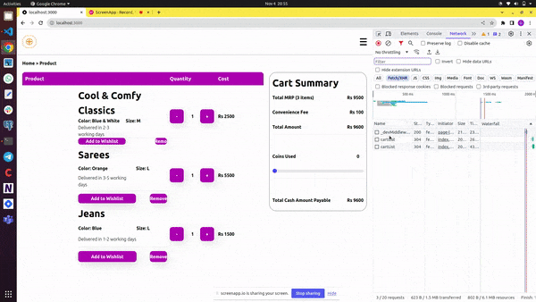


In this tutorial, we'll walk you through creating a simple shopping cart page that can serve as a foundational component for any e-commerce web application. We'll start by setting up a Next.js app and structuring the project with various components and styles.
Step 1: Create a Next.js App
To get started, create a new Next.js app using the following command:
npx create-next-app cart-app
This command will set up the initial project structure for you.
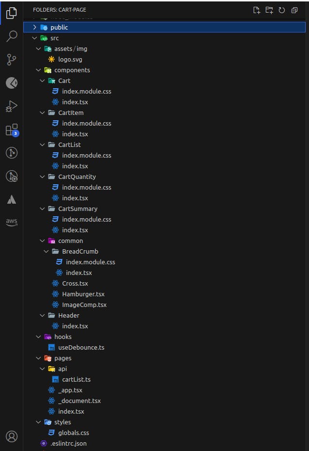
Our folder structure will look something like below
Step 2: Global Styles
We'll begin by defining some global styles in the globals.css file located in the src/styles folder. These styles will include variables for colours and button animations.
/*src/styles/globals.css*/
@tailwind base;
@tailwind components;
@tailwind utilities;

:root {
  --foreground-rgb: 0, 0, 0;
  --background-start-rgb: 214, 219, 220;
  --background-end-rgb: 255, 255, 255;
  --theme-color-pink: #9c27b0;
  --white-font-color: #fff;
}

html {
  box-sizing: border-box;
  font-weight: 600;
}

button {
  position: relative;
  overflow: hidden;
  box-shadow: 6px 7px 40px -4px rgba(0, 0, 0, 0.2);
}

button span {
  position: absolute;
  border-radius: 50%;
  /* To make it round */
  background-color: rgba(0, 0, 0, 0.3);

  width: 100px;
  height: 100px;
  margin-top: -50px;
  /* for positioning */
  margin-left: -50px;

  animation: ripple 1s;
  opacity: 0;
}

/* Add animation */
@keyframes ripple {
  from {
    opacity: 1;
    transform: scale(0);
  }

  to {
    opacity: 0;
    transform: scale(10);
  }
}
Step 3: Create a Sample Cart API
We'll set up a sample cart API in the src/pages/api/cartList.ts file. This API will provide cart data, including items' names, colours, sizes, delivery estimates, quantities, and prices.
//src/pages/api/cartList.ts
// Next.js API route support: https://nextjs.org/docs/api-routes/introduction
import type { NextApiRequest, NextApiResponse } from "next";

type Data = {
  id: number;
  name: string;
  color: string;
  size: string;
  eta: string;
  quantity: number;
  price: number;
};

export default function handler(
  req: NextApiRequest,
  res: NextApiResponse<{ convenienceFee: number; data: Data[] }>
) {
  res.status(200).json({
    convenienceFee: 100,
    data: [
      {
        id: 1,
        name: "Cool & Comfy Classics",
        color: "Blue & White",
        size: "M",
        eta: "Delivered in 2-3 working days",
        quantity: 1,
        price: 2500,
      },
      {
        id: 2,
        name: "Sarees",
        color: "Orange",
        size: "L",
        eta: "Delivered in 3-5 working days",
        quantity: 1,
        price: 5500,
      },
      {
        id: 3,
        name: "Jeans",
        color: "Blue",
        size: "L",
        eta: "Delivered in 1-2 working days",
        quantity: 1,
        price: 1500,
      },
    ],
  });
}
Step 4: Create the Cart Page
In the src/pages/index.tsx file, we create the main page that includes the cart and header components. We also use the React state to manage the cart's visibility.
//src/pages/index.tsx
import Cart from "@/components/Cart";
import Header from "@/components/Header";
import { useState } from "react";

export default function Home() {
  const [isOpenSideDrawer, setIsOpenSideDrawer] = useState(false);

  return (
    <div onClick={() => setIsOpenSideDrawer(false)}>
      <Header
        isOpenSideDrawer={isOpenSideDrawer}
        setIsOpenSideDrawer={setIsOpenSideDrawer}
      />
      <Cart />
    </div>
  );
}
Step 5: Create the Header Component
The Header component, located in src/components/Header/index.tsx, contains navigation links, a logo, and a hamburger icon for the side drawer. It uses props to manage the drawer's state.
//src/components/Header/index.tsx
import React from "react";
import Hamburger from "../common/Hamburger";
import Cross from "../common/Cross";
import ImageComp from "../common/ImageComp";
import LOGO from "../../assets/img/logo.svg";

const Header = ({
  isOpenSideDrawer = false,
  setIsOpenSideDrawer = (p: any) => {},
}) => {
  return (
    <div
      style={{
        display: "grid",
        justifyContent: "end",
        alignItems: "center",
        boxShadow: "1px 4px #e9e5e5",
        gridTemplateColumns: "1fr 1fr",
        padding: "20px",
      }}
    >
      <ImageComp
        isNextImage
        src={LOGO}
        height={"50px"}
        width={"50px"}
        alt="logo"
      />
      <div
        style={{ justifySelf: "end", cursor: "pointer" }}
        onClick={(ev) => {
          ev.stopPropagation();
          setIsOpenSideDrawer((prev: any) => !prev);
        }}
      >
        {isOpenSideDrawer ? <Cross /> : <Hamburger />}
      </div>
    </div>
  );
};

export default Header;
Step 6: Create Hamburger and Cross Icon Components
These components, Hamburger and Cross, are used for the navigation menu icon. They are simple and visually represent a hamburger menu and a close icon.
//src/components/common/Hamburger.tsx
import React from "react";

const Hamburger = () => {
  return (
    <div
      style={{
        display: "flex",
        flexDirection: "column",
        justifyContent: "space-between",
        height: "25px",
        width: "25px",
        borderRadius: "10px",
      }}
    >
      <div
        style={{ height: "4px", background: "black", borderRadius: "4px" }}
      ></div>
      <div
        style={{ height: "4px", background: "black", borderRadius: "4px" }}
      ></div>
      <div
        style={{ height: "4px", background: "black", borderRadius: "4px" }}
      ></div>
    </div>
  );
};

export default Hamburger;
//src/components/common/Cross.tsx
import React from "react";

const Cross = () => {
  return (
    <div
      style={{
        display: "flex",
        flexDirection: "column",
        justifyContent: "center",
        height: "25px",
        width: "25px",
        position: "relative",
      }}
    >
      <div
        style={{
          height: "4px",
          background: "black",
          transform: "rotate(-40deg)",
          position: "absolute",
          width: "25px",
          borderRadius: "4px",
        }}
      ></div>
      <div
        style={{
          height: "4px",
          background: "black",
          transform: "rotate(40deg)",
          position: "absolute",
          width: "25px",
          borderRadius: "4px",
        }}
      ></div>
    </div>
  );
};

export default Cross;
Step 7: Create Image Component
The ImageComp component handles both regular and Next.js image imports. It selects the appropriate rendering method based on the isNextImage prop.
For Next.js image imports we need to configure the base path of images in the next.config.js file. Refer https://stackoverflow.com/questions/66533981/next-image-configuration-in-next-js-config-file
//src/components/common/ImageComp.tsx
import Image from "next/image";
import React from "react";

const ImageComp = ({
  isNextImage = false,
  src,
  alt = "image",
  height = "100%",
  width = "100%",
}: any) => {
  return (
    <>
      {(() => {
        if (isNextImage) {
          return <Image src={src} alt={alt} style={{ height, width }} />;
        }
        return <img src={src} alt={alt} style={{ height, width }} />;
      })()}
    </>
  );
};

export default ImageComp;
Step 8: Create a Cart Component
The Cart component in src/components/Cart/index.tsx represents the main cart page. It includes a breadcrumb component the actual cart list and summary components. We use context to manage cart data.
//src/components/Cart/index.tsx
import React, { createContext, useContext, useEffect, useState } from "react";
import css from "./index.module.css";
import CartList from "../CartList";
import CartSummary from "../CartSummary";
import BreadCrumb from "../common/BreadCrumb";

const CartContext = createContext({
  cartList: [],
  setCartList: () => {},
});

export const useCartContext = () => useContext(CartContext);

const Cart = () => {
  const [cartList, setCartList] = useState({
    convenienceFee: 0,
    data: [],
  });

  useEffect(() => {
    (async () => {
      const response = await fetch("http://localhost:3000/api/cartList");
      const cartListData = await response.json();
      setCartList(cartListData);
    })();
  }, []);

  const cartContextValue: any = { cartList, setCartList };

  return (
    <>
      <BreadCrumb />
      <CartContext.Provider value={cartContextValue}>
        {Array.isArray(cartList.data) && !!cartList.data.length ? (
          <div className={css.cartPage}>
            <div className={css.cartList}>
              <CartList />
            </div>
            <div className={css.cartSummary}>
              <CartSummary />
            </div>
          </div>
        ) : (
          <div
            style={{
              height: "50vh",
              display: "grid",
              alignItems: "center",
            }}
          >
            <h1 style={{ textAlign: "center" }}>No Result found!</h1>
          </div>
        )}
      </CartContext.Provider>
    </>
  );
};

export default Cart;
//src/components/Cart/index.module.css
.cartPage {
  display: grid;
  grid-template-columns: 70% 30%;
  grid-template-areas: "CartList CartSummary";
  gap: 20px;
  margin: 20px;
}

.cartList {
  grid-area: CartList;
}

.cartSummary {
  grid-area: CartSummary;
}

.divider{
  height: 10px;
}
Step 9: Create Breadcrumb Component
The BreadCrumb component is a simple navigation breadcrumb that helps users navigate back to the product page.
//src/components/common/BreadCrumb/index.tsx
import React from "react";
import css from "./index.module.css";

const BreadCrumb = () => {
  return (
    <nav aria-label="Breadcrumb" className={css.breadcrumb}>
      <ul>
        <li>
          <a href="#">Home</a>
        </li>
        <li>
          <span aria-current="page">Product</span>
        </li>
      </ul>
    </nav>
  );
};

export default BreadCrumb;
/*src/components/common/BreadCrumb/index.module.css*/
.breadcrumb {
  margin: 20px;
}

.breadcrumb ul {
  display: flex;
  flex-wrap: wrap;
  list-style: none;
  margin: 0;
  padding: 0;
}

.breadcrumb li:not(:last-child)::after {
  display: inline-block;
  margin: 0 0.25rem;
  content: ">";
}
Step 10: Create Cart List Component
The CartList component displays the list of items in the cart. It uses the CartItem and CartQuantity components to render item details and quantity controls.
//src/components/CartList/index.tsx
import React, { Fragment } from "react";
import css from "./index.module.css";
import CartItem from "../CartItem";
import CartQuantity from "../CartQuantity";
import { useCartContext } from "../Cart";

const CartList = () => {
  const { cartList }: any = useCartContext();
  return (
    <div className={css.cartList}>
      <div className={`${css.product} ${css.header}`}>Product</div>
      <div className={`${css.quantity} ${css.header}`}>Quantity</div>
      <div className={`${css.cost} ${css.header}`}>Cost</div>
      {cartList?.data?.map((cartItem: any, index: number) => (
        <Fragment key={index}>
          <div className={css.gridBody}>
            <CartItem dataIndex={index} cartItem={cartItem} />
          </div>
          <div className={css.gridBody}>
            <CartQuantity dataIndex={index} cartItem={cartItem } />
          </div>
          <div className={css.gridBody}>Rs {cartItem?.price || 0}</div>
        </Fragment>
      ))}
    </div>
  );
};

export default CartList;
/*src/components/CartList/index.module.css*/
.cartList {
  display: grid;
  grid-template-columns: 3fr repeat(2, 1fr);
  grid-template-areas: "Product Quantity Cost";
}

.header {
  font-size: large;
  color: var(--white-font-color);
  padding: 10px 0;
  background: var(--theme-color-pink);
  position: relative;
  padding-left: 10px;
}

.gridBody {
  padding-left: 10px;
  padding-top: 10px;
  align-self: center;
}

.header:first-child {
  border-top-left-radius: 10px;
}

.header:nth-child(3) {
  border-top-right-radius: 10px;
}

.product {
  grid-area: Product;
}

.quantity {
  grid-area: Quantity;
}

.cost {
  grid-area: Cost;
}
Step 11: Create CartItem Component
The CartItem component displays individual items in the cart, including their name, color, size, delivery time, and action buttons for adding to the wishlist and removing from the cart.
//src/components/CartItem/index.tsx
import React from "react";
import css from "./index.module.css";
import ImageComp from "../common/ImageComp";
import { useCartContext } from "../Cart";

//This code creates a ripple effenct on clicking action buttons
export const addRippleSpan = (e: any) => {
  // Create span element
  let ripple = document.createElement("span");

  // Add ripple class to span
  ripple.classList.add("ripple");

  // Add span to the button
  e.target.appendChild(ripple);

  // Get position of X
  let x = e.clientX - e.target.offsetLeft;

  // Get position of Y
  let y = e.clientY - e.target.offsetTop;

  // Position the span element
  ripple.style.left = `${x}px`;
  ripple.style.top = `${y}px`;

  // Remove span after 0.3s
  setTimeout(() => {
    ripple.remove();
  }, 300);
};

const CartItem = ({ cartItem, dataIndex }: any) => {
  const { cartList, setCartList }: any = useCartContext();

  const handleAddWishlist = (e: any) => {
    addRippleSpan(e);
  };

  const handleRemoveItem = (e: any) => {
    addRippleSpan(e);
    const cartListDataCopy = JSON.parse(JSON.stringify(cartList.data));
    cartListDataCopy.splice(dataIndex, 1);
    setCartList({ ...cartList, data: cartListDataCopy });
  };

  return (
    <div className={css.cartItem}>
      <figure className={css.cartItemImage}>
        <ImageComp
          src={`https://source.unsplash.com/random/200x200?sig=${
            Math.random() * 1000
          }`}
        />
      </figure>
      <article className={css.cartItemDescriptionContainer}>
        <h3 className={css.cartItemName}>{cartItem?.name || ""}</h3>
        <p className={css.cartItemColor}>
          {cartItem?.color ? `Color: ${cartItem?.color}` : ""}
        </p>
        <p className={css.cartItemSize}>
          {cartItem?.size ? `Size: ${cartItem?.size}` : ""}
        </p>
        <p className={css.cartItemDeliveryTime}>{cartItem?.eta}</p>
        <hr className={css.hr} />
        <button
          className={`${css.wishlistActionBtn}`}
          onClick={handleAddWishlist}
        >
          Add to Wishlist
        </button>
        <button className={`${css.removeActionBtn}`} onClick={handleRemoveItem}>
          Remove
        </button>
      </article>
    </div>
  );
};

export default CartItem;
/*src/components/CartItem/index.module.css*/
.cartItem {
  display: grid;
  grid-template-columns: 2fr 5fr;
  grid-template-areas: "CartItemImage CartItemDescriptionContainer";
  column-gap: 10px;
}

.cartItemImage {
  grid-area: CartItemImage;
  height: 200px;
  width: 180px;
}

.cartItemDescriptionContainer {
  grid-area: CartItemDescriptionContainer;
  display: grid;
  grid-template-areas:
    "CartItemName CartItemName CartItemName CartItemName ."
    "CartItemColor CartItemColor CartItemSize . ."
    "CartItemDeliveryTime CartItemDeliveryTime . . ."
    "Hr Hr Hr Hr Hr"
    "WishlistActionBtn WishlistActionBtn . . RemoveActionBtn";
}

.hr {
  grid-area: Hr;
}

.cartItemName {
  grid-area: CartItemName;
  font-size: 35px;
}

.cartItemColor {
  grid-area: CartItemColor;
}

.cartItemSize {
  grid-area: CartItemSize;
}

.cartItemDeliveryTime {
  font-weight: 300;
  grid-area: CartItemDeliveryTime;
}

.wishlistActionBtn {
  grid-area: WishlistActionBtn;
  background: var(--theme-color-pink);
  color: var(--white-font-color);
  border-radius: 10px;
}

.removeActionBtn {
  grid-area: RemoveActionBtn;
  background: var(--theme-color-pink);
  color: var(--white-font-color);
  border-radius: 10px;
}
Step 12: Create CartQuantity Component
The CartQuantity component manages the quantity of items in the cart. It allows users to increase or decrease the quantity of an item.
//src/components/CartQuantity/index.tsx
import React from "react";
import css from "./index.module.css";
import { addRippleSpan } from "../CartItem";
import { useCartContext } from "../Cart";

const CartQuantity = ({ dataIndex, cartItem }: any) => {
  const { cartList, setCartList }: any = useCartContext();

  const handleIncreaseQuantity = (e: any, itemId: number) => {
    addRippleSpan(e);
    const newQty = +cartItem?.quantity + 1;
    const cartListDataCopy = JSON.parse(JSON.stringify(cartList.data));
    cartListDataCopy[dataIndex] = {
      ...cartListDataCopy[dataIndex],
      quantity: newQty,
    };
    setCartList({ ...cartList, data: cartListDataCopy });
  };

  const handleDecreaseQuantity = (e: any, itemId: number) => {
    addRippleSpan(e);
    if (cartItem?.quantity === 1) return;
    const newQty = +cartItem?.quantity - 1;
    //deep copy
    const cartListDataCopy = JSON.parse(JSON.stringify(cartList.data));
    cartListDataCopy[dataIndex] = {
      ...cartListDataCopy[dataIndex],
      quantity: newQty,
    };
    setCartList({ ...cartList, data: cartListDataCopy });
  };

  return (
    <div className={css.cartQuantityContainer}>
      <button
        onClick={(ev) => handleDecreaseQuantity(ev, cartItem?.id)}
        className={css.btn}
      >
        -
      </button>
      <span className={css.qtyVal}>{cartItem?.quantity || 0}</span>
      <button
        onClick={(ev) => handleIncreaseQuantity(ev, cartItem?.id)}
        className={css.btn}
      >
        +
      </button>
    </div>
  );
};

export default CartQuantity;
/*src/components/CartQuantity/index.module.css*/
.cartQuantityContainer {
  display: grid;
  grid-template-columns: 1fr 1fr 1fr;
  justify-content: space-between;
}

.qtyVal {
  text-align: center;
  align-self: center;
}

.btn {
  color: var(--white-font-color);
  background: var(--theme-color-pink);
  border-radius: 10px;
  height: 50px;
  width: 50px;
}
Step 13: Create CartSummary Component
The CartSummary component calculates the total cost, convenience fee, coins used, and the final cash amount payable. Users can adjust the coins used to pay for their orders. Here we have considered the coin conversion rate as 1 coin = Rs 1
//src/components/CartSummary/index.tsx
import React, { useEffect, useState } from "react";
import css from "./index.module.css";
import { useDebounce } from "@/hooks/useDebounce";
import { useCartContext } from "../Cart";

const initialState = {
  coinsUsed: 0,
  totalMrp: 0,
  totalAmount: 0,
  maxCoins: 0,
  totalCashAmountPayable: 0,
};

//coinBalance is generally generated based on various
//payments and offers provided by client app which can be
//redeemed by making orders.
const CartSummary = ({ coinsBalance = 210 }: any) => {
  const { cartList }: any = useCartContext();
  const [cartSummaryDetails, setCartSummaryDetails] = useState(initialState);

  useEffect(() => {
    const totalMrp = getTotalMrp();
    const totalAmount = getTotalAmount(totalMrp);
    const maxCoins = getMaxCoins(totalAmount);
    const totalCashAmountPayable = getTotalCashAmountPayable(totalAmount);
    setCartSummaryDetails({
      ...cartSummaryDetails,
      totalMrp,
      totalAmount,
      maxCoins,
      totalCashAmountPayable,
    });
  }, [useDebounce(cartSummaryDetails.coinsUsed), useDebounce(cartList)]);

  const getTotalCostOfItem = (price: number, qty: number) => +price * +qty;

  const getTotalMrp = () => {
    return +cartList?.data?.reduce(
      (accumulator: number, currentValue: any) =>
        +accumulator +
        getTotalCostOfItem(currentValue?.price, currentValue?.quantity),
      0
    );
  };

  const getTotalAmount = (totalMrp: number) =>
    +cartList?.convenienceFee + +totalMrp;

  const getMaxCoins = (totalAmount: number) =>
    totalAmount > coinsBalance ? coinsBalance : totalAmount;

  const handleChangeForCoins = (ev: any) => {
    setCartSummaryDetails({
      ...cartSummaryDetails,
      coinsUsed: ev.target.value,
    });
  };

  const getTotalCashAmountPayable = (totalAmount: number) => {
    return +totalAmount - +cartSummaryDetails.coinsUsed;
  };

  return (
    <div className={css.orderSummary}>
      <h1 className={css.cartSummaryTitle}>Cart Summary</h1>
      <div className={css.cartSummaryBody}>
        <p>
          Total MRP ({cartList?.data?.length || 0}{" "}
          {cartList?.data?.length < 2 ? "item" : "items"})
        </p>
        <strong className={css.cartSummaryValue}>
          Rs {cartSummaryDetails.totalMrp}
        </strong>
      </div>
      <div className={css.cartSummaryBody}>
        <p>Convenience Fee</p>
        <p className={css.cartSummaryValue}>Rs {cartList?.convenienceFee}</p>
      </div>
      <div className={css.cartSummaryBody}>
        <strong>Total Amount</strong>
        <strong className={css.cartSummaryValue}>
          Rs {cartSummaryDetails.totalAmount}
        </strong>
      </div>
      <hr />
      <div className={css.cartSummaryBody}>
        <label>Coins Used</label>
        <input
          style={{ textAlign: "end" }}
          className={css.cartSummaryValue}
          type="number"
          value={cartSummaryDetails.coinsUsed}
          min={0}
          max={cartSummaryDetails.maxCoins}
          onChange={handleChangeForCoins}
        />
      </div>
      <div className={css.cartSummaryRange}>
        <input
          style={{ cursor: "pointer" }}
          type="range"
          value={cartSummaryDetails.coinsUsed}
          min={0}
          max={cartSummaryDetails.maxCoins}
          onChange={handleChangeForCoins}
        />
      </div>
      <hr />
      <div className={css.cartSummaryBody}>
        <strong>Total Cash Amount Payable</strong>
        <strong className={css.cartSummaryValue}>
          Rs {cartSummaryDetails.totalCashAmountPayable}
        </strong>
      </div>
    </div>
  );
};

export default CartSummary;
/*src/components/CartSummary/index.module.css*/
.orderSummary {
  border: 2px solid rgb(182, 182, 182);
  margin-right: 20px;
  padding: 10px;
  border-radius: 25px;
  display: grid;
  grid-template-rows: repeat(9, 1fr);
}

.cartSummaryTitle {
  font-size: 35px;
}

.cartSummaryBody {
  display: grid;
  grid-template-columns: 7fr 3fr;
  align-items: center;
}

.cartSummaryValue{
  justify-self: end;
}

.cartSummaryRange{
  display: grid;
}
Step 14: Create the useDebounce Hook
The useDebounce hook is a utility function used to debounce changes in values. It's used to manage debouncing the coins input and cart list changes in our application.
//src/hooks/useDebounce.ts
import { useState, useEffect } from "react";

export const useDebounce = (value: any, milliSeconds = 1000) => {
  const [debouncedValue, setDebouncedValue] = useState(value);

  useEffect(() => {
    const handler = setTimeout(() => {
      setDebouncedValue(value);
    }, milliSeconds);

    return () => {
      clearTimeout(handler);
    };
  }, [value, milliSeconds]);

  return debouncedValue;
};
That completes our tutorial on creating a simple shopping cart page in a Next.js app. We've covered the setup, components, and styles needed to build this foundational component for an e-commerce web application. Happy coding!